Step into the greatest fashion stores around the world
A virtual tour of the world’s finest fashion stores, from London to Tokyo, Atlanta to Shanghai
- (opens in new tab)
- (opens in new tab)
- (opens in new tab)
- Sign up to our newsletter Newsletter
From Loewe’s art-filled boutique in Barcelona, Spain, to Courrèges ‘rave ambience’ architecture in New York, Wallpaper* steps inside the world’s best-designed fashion stores.
Inside the best global fashion stores
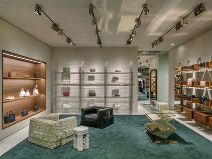
Bottega Veneta, Zurich, Switzerland (top)

A new Bottega Veneta store opens this month (December 2022) in Zurich, Switzerland, marking the Italian house’s flagship store in the country. A reflection of Bottega Veneta’s roots in ‘craftsmanship, creativity and Italian design’, and the luxurious pragmatism of current creative director Matthieu Blazy, the 180 sq m space features custom seating by Cassina (drawing inspiration from Mario Bellini’s 932 modular sofas) and door handles reminiscent of those found on the house’s ‘Sardine’ handbag. The store – located in the heart of Zurich on Bahnhofstraße 25 – features mens- and womenswear, alongside a series of unique items.
66 North, London, United Kingdom

Icelandic heritage brand 66 North – known for its enveloping parkas and puffer jackets – has opened a new outpost on London’s Regent Street (the 3,500 sq ft space marks the first outside of Iceland and Denmark). Designed by Berlin-based architect Gonzalez Haase, the ‘experiential’ store features tactile walls clad in ‘rammed earth’, sculptures reminiscent of magma (a common appearance in Iceland), and a mesh lighting system with effects which mimic a ‘misty white sky’.
’66 North was founded in 1926 to protect Icelandic fishermen from the challenges of the Arctic Circle. Ever since then, we’ve made quality products that withstand the elements, all in the name of promoting a life lived in harmony with nature,’ says 66 North CEO Helgi Oskarsson. ‘The best way to present the brand and tell its sustainability story is to showcase the quality and durability of the product in our own stores.’
Self-Portrait, London, United Kingdom

A new Self-Portrait store – located at the corner of Chelsea’s King’s Road and Duke of York Square in London – was designed by architect Andreas Kostopoulos, co-founder of MPNYC. Featuring mint-green tones throughout for a ‘soothing yet distinctive atmosphere’, the store also includes natural oxide pigments, stainless steel elements (brushed, honed or highly polished) and plenty of mirrors. ‘Riffing on the Self-Portrait as a thematic focus, the design emphasises reflective surfaces while abstracting all other architectural components into a singular background layer, with uniformly pigmented Cornish clay walls and terrazzo floors,’ says Kostopoulos. ‘By leveraging minimalism, materiality, and colour, we wanted to create a more self-centred experience, filtering out the visually distracting architectural qualities and functions that typically overwhelm retail environments.’
Candamill, New York, United States

New York-based Candamill, known for its architectural handbags, has opened a playful concept store at 277 Mott Street, Manhattan. An ’immersive art installation’ made to celebrate two single handbags, the space comprises a simulated landscape through organic elements and light and sound design. Conceived to be viewed at street level (or by limited appointment), it serves ‘as a conversation piece spotlighting the brick-and-mortar retail store’s purpose in the fashion industry today’. Indeed, instead of the usual means of purchasing products, QR codes direct would-be shopper’s to Candamill’s website.
Dolce & Gabbana Holiday Market, London, United Kingdom
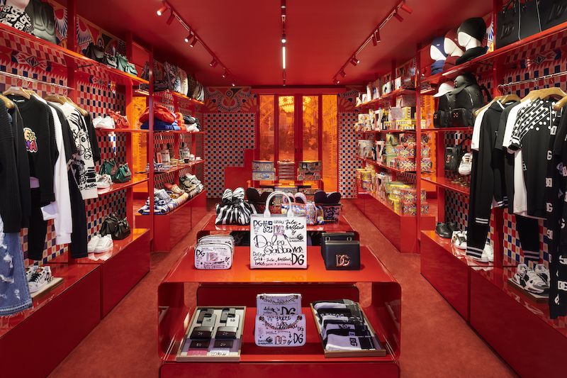
From this month (November 2022), Dolce & Gabbana celebrate the arrival of the festive season with a special pop up in London’s Covent Garden. Featuring the colours and symbols of Sicily – the Italian island which has become synonymous with the house – the special ‘holiday market’ features unique items made in collaboration with Italian heritage brands Fiasconaro, Pastificio Di Martino, Donnafugata and Baci Perugina (presented here on Sicilian cart decorations). Shoppers will also be able to purchase items from the Dolce & Gabbana Casa collection, alongside an array of accessories, shoes and clothing from the house’s recent ready-to-wear collections. Until January 15 2023.
Cubitts, Edinburgh, United Kingdom

British eyewear brand Cubitts – the ‘modern spectacle maker’ is known for its vintage-tinged handmade frames – arrives in Edinburgh this month, opening two new addresses in the Scottish city’s Old and New Town (the stores take Cubitts total in the UK to 15). Typically elegant interiors – wood-lined, with traditional apothecary-style shelving and modernist details – house the brand’s collections, including two new exclusive frames at each of the stores. ‘We have the best of both worlds,’ says Tom Broughton, the founder of Cubitts. ‘Services in the New Town, spectacles in the Old Town, in two distinct but equally remarkable buildings, each with a rich history.’
AlphaTauri, London, United Kingdom

Salzburg-based label AlphaTauri – an offshoot of the Red Bull-owned Formula One racing team of the same name – has opened its first UK store in London’s Knightsbridge neighbourhood. Designed by Berlin, Vienna and LA-based Studio Riebenbauer, the interior’s sleek, brushed metal surfaces, interactive digital elements and complex installations (inspired by its knitwear and parkas) reflect the brand’s innovation-based approach to clothing, while a deconstructed AlphaTauri racing car erected on the wall provides a dramatic focal point. ‘The opening of our first international flagship store in London is another important milestone towards our global recognition,’ CEO Ahmet Mercan tells Wallpaper. ‘With the store design, we wanted to transmit our brand identity. It’s a well thought out combination of digital, innovative and interactive elements, to allow visitors to explore our world of design, premium materials and textile innovations.’
Toteme, New York, United States

Toteme co-founders Karl Lindman and Elin Kling cement their foothold in the United States with the brand’s New York flagship, located on SoHo’s cobbled Mercer Street. The duo called on their longtime collaborators, Swedish architects Halleroed, to help design the 3300-square-foot space. Colourful furniture – like a Josef Frank sofa for Svenskt Tenn in vibrant flora and fauna print – contrasts the otherwise minimal interior, while works by Marc Newson, Elizabeth Payton and Cony Meier are dotted around the art-filled space. Custom-made lighting designed by Christian Halleröd takes inspiration from legendary Swedish architect Gunnar Asplund – a nod to Toteme’s own Scandinavian roots. Tilly Macalister-Smith
A|X Armani Exchange, London, United Kingdom

Following openings in Milan, Amsterdam and Berlin, this month A|X Armani Exchange celebrates the arrival of its third store in London, located on Regent Street. Housed in the historic 19th-century Westmorland House, the store retains the building’s dramatic neoclassical corner facade, while the 290-square-metre interior across two levels has a sleek, fluid design – oak-effect slats for walls, pale stone-effect floors and a contrasting ceiling in black – which reflects A|X Armani Exchange’s contemporary collections. Imagined by Giorgio Armani alongside a team of architects, the new London store reflects the brand’s other new-generation spaces, including a desire to keep environmental effects to a minimum – from materials, finishes and lighting to retaining internal structures. As such, all metal and glass elements are removable, reusable and recyclable, while lights uses innovative LED technology designed to minimise energy consumption.
Courrèges, New York, United States
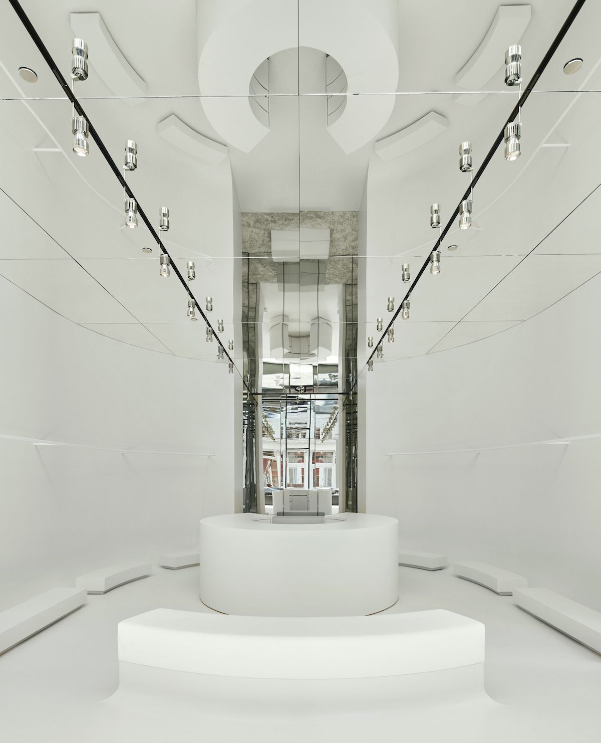
Courrèges’ latest store, which opened in New York to coincide with the city’s fashion week, marks the French house’s return to the United States (in its 1970s heyday, Courrèges had stores in Los Angeles and New York). Featuring a distinct design by Belgian architect Bernard Dubois, the Soho space (104 Grand Street) is rendered in gleaming white, with smooth geometric fixtures reminiscent of both house founder André Courrèges’ futurist fixations and current creative director Nicolas Di Felice’s knack for angular cool. The back room is made to evoke a ‘rave ambience’ – Di Felice has noted his love of techno while growing up in Belgium, and recently hosted a Courrèges rave on the outskirts of Paris – with a mirrored ceiling and ‘club-grade’ spotlights.
Ant/Dote, Atlanta, United States

Founded by Lauren Amos (of store Wish ATL) and fashion journalist Eugene Rabkin, Ant/Dote is a new multi-brand retailer in Atlanta, Georgia stocking an array of international avant garde-leaning labels, among them Comme des Garçons, Junya Watanabe, Noir by Kei Ninomiya, Paco Rabanne, Y/Project, Craig Green and more. (The head buyer is Karlo Steel, who co-founded seminal New York menswear retailer Atelier New York; Ant/Dote will be the exclusive Atlanta retailer for several of the labels.) Located in the West Midtown neighbourhood, Ant/Dote resides in a converted art deco building, originally used as a Kodak laboratory for classified government projects during the 1950s. Working with Chris Benfield of Benfield Partners on the store’s design – Benfield has previously created stores for Rick Owens, Dior and Balenciaga – shoppers are greeted with a sleek monochromatic facade, applied over the building’s original red brick, and ‘conceptual garden vitrines’ created by WrinkleMX studio. Inside, hand-poured terrazzo floors and plaster walls provide a blank backdrop for the various garments’ distinct silhouettes, while a monolithic cash desk provides the centrepiece of the space. More fluid lines are found on the cave-like lower level, housing the store’s accessories offering and VIP lounge.
Marni, Shanghai, China

In Shanghai, London-based studios The Wilson Brothers and Brinkworth continue a partnership with Marni which began with a redesign of the Italian brand’s Milan store. It is part of creative director Francesco Risso’s desire to ‘radically reimagine contemporary retail stores’; as such, the design centres on ‘a vessel for creativity’, a space within the store designed to inspire ‘community, creativity and culture’. In Milan, it took the form of a studio enclosed in a stack of cars and caravans, in Shanghai, a ‘rock-like sculpture’ has been created, ready to ‘welcome a rotation of artists-in-residence’ (the first will be Shanghai-based Nathan Zhou, who has created a series of colourful paintings which adorn the interior). ‘I admire Francesco’s ambition to create spaces for artistic endeavour,’ says Adam Brinkworth, founder of Brinkworth, of the collaboration. ‘For me, this places Marni as a patron of the arts.’
Alaïa, Paris, France

Renovated according to designs by Marc Newson, Alaïa’s reopened 5 Rue de Moussy store – just next door to the house’s atelier in Paris’ Marais district – provides a ‘restored and revived’ space to showcase Pieter Mulier’s collections (the Belgium designer began his tenure in 2021, the first creative director since Azzedine Alaïa’s death in 2017). Described as ‘a space dedicated to beauty’, art, fashion and high design intermingle in the store’s rooms; a portrait of the late designer greets visitors upon entry, while works by Ron Arad, Julian Schnabel and Newson are found throughout an otherwise minimal design. ‘The space that shaped the history of Azzedine Alaïa is once again a place for exchanges, encounters and discoveries,’ say the house of the store, which marks a new chapter in Mulier’s vision for Alaïa – one still infused with the inimitable creative spirit of the house’s namesake.
Loewe, Barcelona, Spain
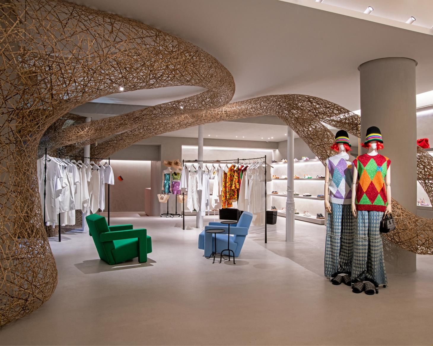
Promising ‘luxury, intimacy, and culture’, the redesigned Casa Loewe on Barcelona’s Paseo de Gracia distils creative director Jonathan Anderson’s vision for the Spanish house, which centres on a deep-rooted commitment to craft, art and design. As such, the space – first designed by Catalan Modernist Lluís Domènech i Montaner – sees Loewe’s collections interspersed with commissioned installations by artists such as Tanabe Chikuunsai IV, whose bamboo sculpture will provide a centrepiece to the store, and Catalan artist Aurèlia Muñoz, who has created a large-scale hanging sculpture in macramé (other contemporary artists in the space include Haegue Yang, Richard Tuttle, Zizipho Poswa and Takayuki Sakiyama). Elsewhere, a breathtaking array of historical works will also feature, adding to Loewe’s ever-expanding collection – notably, a series of eight ceramics by Pablo Picasso. The luxurious fittings also ally with this idea of craft and hand-feel, from maple-wood counters, warm concrete floors, and vivid pillars and tiles – in shades designed to be reminiscent of the Mediterranean Sea – created by 1880-founded Catalan ceramic factory Ceràmica Cumella.
loewe.com (opens in new tab)
Theory, London, United Kingdom

Theory’s new London flagship marks a milestone for the American label – rather than a typical standalone space, it is instead situated inside a vast new Uniqlo store found on the city’s Regent Street (together, the two stores number 1,900 sq m). London-based architecture studio
Sybarite created Theory’s ground-floor space, a sleek, minimal design in camel, beige and caramel which the brand says captures its essence, one of ‘modernity, balance, and openness’. Shoppers are encouraged to purchase simple layers – ‘constantly uncovered as the customer navigates around and through the environment’ – from a sharp edit of foundational pieces from the brand’s men's and women’s collections. Alongside the comprehensive offering from Uniqlo, the two stores combine to create a unique and contemporary take on the traditional department store.
theory.com (opens in new tab)
Gentle Monster, Shanghai, China

A robot surveys shoppers as they enter Gentle Monster's latest boutique in Shanghai – an expansive multidisciplinary five-storey space in the city's Huangpu District – which celebrates the optical brand's innovative and technologically-led approach to retail design. Gentle Haus also welcomes a host of other labels into its location: surrealist dessert brand Nuddake on its ground floor and the first Chinese flagship boutique of South Korean beauty brand Tamburins on its fourth. It took a year to develop the robotic face that sits on the 3rd floor of Gentle Haus, created by the brand's Robotics lab, as part of an exhibition space that will host roving shows and pop-up events.
gentlemonster.com (opens in new tab)
Balenciaga, London, United Kingdom

Stroll past Balenciaga's 772 sq m boutique on Sloane Street in London and you'd be forgiven for thinking the space was in a state of non-completion. In fact, the untreated textures, cracked and stained poured concrete flooring and blackened stairwells are synonymous with the French maison's latest 'Raw' architectural retail concept, one which revels in industrial flourishes and exposed fittings and the drama of the dilapidated. Here, electrical wires, air ducts and support beams are exposed and an unfinished elevator core even takes centre stage in the store. We suggest you walk past the boutique again.
balenciaga.com (opens in new tab)
Bally, London, United Kingdom

A magnificent, column-lined facade on the corner of Regent Street in Central London beckons design-led shoppers into Bally’s new 400 sq m flagship boutique. An evolution of the Swiss brand’s experiential multi-functional retail environments, first launched in Milan’s Montenapoleone boutique in 2019, the space is centralised on visual contrasts, juxtaposing marble with terracotta, and alludes to the UK's capital city's topographical and architectural history. Conceived in collaboration with Seen Displays, a London-based creative design and production agency, the store also boasts pieces designed by materiality-focused designer and maker James Shaw, on a series of strata-focused naturalistic plinths and fixtures, crafted using rammed earth, in a nod to the foundational clay of London’s architecture.
Rinascente, Rome, Italy

Designers Frederik De Wachter and Alberto Artesani of Milanese practice DWA have created a new interior for the fourth floor of Rinascente in Rome’s Piazza Fiume. This is the first step of an ambitious redesign of the iconic building originally conceived in 1961 by Franco Albini and Franca Helg, carried out by architect Ippolito Pestellini Laparelli’s Studio 2050 and due to be completed in 2023, while the 4th floor womenswear department by DWA is the first to open, in summer 2021. The colour palette is based on imposing shades of brick red on the ceiling and mint green on the display elements made of tubular sheets. ‘We tried to find a balance between the identity of our design codes and the importance of using the space of the original project,’ say the designers. ‘It is a design made of contrasts, distributed on almost imperceptible levels.’ Writer: Rosa Bertoli
John Lobb, Beverly Hills, USA

The founder of heritage British bootmaker John Lobb famously walked from Cornwall to London in 1851 to fulfil his footwear dreams, and now the label has taken its own recent saunter around the globe. The brand is opening a series of boutiques, from Paris to Beverly Hills, designed by French architecture studio ciguë, which has also worked on retail spaces for Vejas, Patcharavipa and Aesop. These interior spaces nod to a science fiction spaceship, accented with matte metal and deep walnut wood, and feature fixtures inspired by the Uruguayan artist Gonzalo Fonesca. For lucky luxury shoppers in LA, John Lobb's Californian boutique has also been wrapped in a facade evoking the exposed brick work of the brand's Nottingham factory. It brings a touch of artisanal Britain to Beverly Hills.
Brioni, London, UK

London-based architecture and interior design company P. Joseph had classical inclinations when considering the design of Brioni's London flagship boutique, which encompasses ready-to-wear, footwear and accessories, and a suite for bespoke tailoring. The Bruton Street space in London's Mayfair is inspired by the residence of a Roman man, and its sleek interior marries marble with tuff stone and travertine and mid-century Italian furniture and tapestries from the Fifties and Sixties. There's a serene sense to the space, which denotes a series of luxurious living rooms, as delectable for the contemporary shopper as the classical one.
Acne Studios, Stockholm, Sweden

There's a classical sense of splendour behind Acne Studios' Stockholm boutique. The former bank in the brand's home city, has been stripped back to its essential design, reducing layers of recent renovation in celebration of the building's original neoclassical colonnades. Acne Studios worked with Barcelona-based Arquitectura-G on the interior overhaul of the space, who also designed the label's industrial store in Nagoya, Japan. In a play on duality, real and faux marble are presented together, alongside original and new custom colonnades. Organic slab-like marble furntiture, created by London-based designer Max Lamb, is illuminated by grid-like spotlights, created by French designer and light artist Benoit Lalloz. Lamb and Lalloz also created pieces for Acne Studios' Stockholm headquarters, which opened in November 2019.
acnestudios.com (opens in new tab)
arquitectura-g.com
Maison Margiela, London, UK

Seeking out some architectural retail splendour to spark a serotonin surge on your daily walk? Should you stroll around London's Mayfair, we recommend walking past Maison Margiela's Bruton Street flagship, which has been aesthetically overhauled by Dutch architects Studio Anne Holtrop. The design of the 190 sq m space has been influenced by the textural marking of clothing, and interior elements like columns and walls have been imprinted with the fingerprints of fabric. Creative director of the brand John Galliano was also inspired by the concept of getting dressed in haste, an ideal he holds integral to its aesthetic, and pillars appear dented or curved, as if in motion. For now, we'll be satisfied peering through the windows of the store, and taking in its pared-back and tactility-focused design. When lockdown lifts, we'll be dropping in in person too.
maisonmargiela.com (opens in new tab)
Dolce & Gabbana, Puerto Banús, Spain

An ode to modernist Catalan architecture, the label’s Puerto Banús boutique, in Nueva Andalucía, also offers up a tribute to the ocean. Rustic blue ceramic walls, soft furnishings created from natural rope and a floor created using trencadís – a broken mosaic technique formed from shards of glass, all evoke maritime escape, while floor to ceiling windows reveal a resplendent real time harbour view. On the first floor, a terrace houses Dolce and Gabbana’s Martini Bar – a space synonymous with the brand’s retail vision. Imagine shopping the label's latest Siciliy-inspired wonders, before taking in the Spanish sunset upstairs, sipping on something served with a twist.
dolcegabbana.com (opens in new tab)
Loewe, Soho, New York

Picture settling into this cornflower blue Cassina 637 Utrecht armchair and surveying the art that populates Loewe’s first Manhattan space on Greene Street. In a nod to its other gallery-inspired outposts in cities including London and Tokyo, the oak, Campaspero limestone and concrete-clad space boasts a roster of pieces from the Madrid house’s covetable collection. These include three tapestries depicting photo realist scenes, created by Limoges-based master weavers in France, and conceived originally for the set design of Loewe's S/S 2020 show, and a figurative hand-painted screen by South African artist Lisa Brice. Top marks for spotting a tea bowl by the Japanese ceramicist Takuro Kuwata and 2018 Loewe Foundation Craft Prize (opens in new tab) finalist, who creative director Jonathan Anderson collaborated with for the brand's recent A/W 2020 womenswear show, on a series of sea anemone-like bag adornments and knobbly breastplates.
loewe.com (opens in new tab)
Homme Plissé Issey Miyake, Tokyo, Japan

For his 17th store design for Issey Miyake, Tokyo-based designer Tokujin Yoshioka was inspired by the concept of monozukuri no gemba, or ‘making things.’ The raw concrete walls of the 225sq m space house not just the label’s prismatic Homme Plissé and limited-edition COLOR collections, but also a functional pleating machine. This nods the history of Miyake’s renowned and shrouded in secrecy pleating technology. Here, two Issey Miyake engineers pleat garments – originally cut 1.5 times larger than their final size – live. The Minami-Aoyamal-located street the space is housed on is a Miyake mecca – also playing host to its Issey Miyake mainline, Pleats Please and HaaT to Reality Lab Issey Miyake stores.
isseymiyake.com (opens in new tab)
Prada, Design District, Miami (opens in new tab), US (opens in new tab)

Peek through the white vertical blades that are clustered over Prada's Miami boutique's large windows, and you’ll find a sleek, chequer mosaic-clad treasure trove, dedicated to mid-century Brazilian design. The space – spanning two floors and 650 sq m – is populated with furniture pieces by Joaquim Tenreiro, Carlo Hauner and Martin Eisler, Jorge Zalszupin, José Zanine Caldas and Sérgio Rodrigues. Take a highly-coveted seat and take in the eye-catching walls of the space, which are clad in sea green bas-relief panels, featuring various 3D floral designs from the brand’s ready-to-wear collections.
prada.com (opens in new tab)
Fendi, Sloane Street, London (opens in new tab)

We were such fans of the brand’s 70s-centric Dimorestudio-designed Sloane Street outpost, that we awarded its seductive VIP room our ‘Best Personal Space’ (opens in new tab) gong in 2018’s Wallpaper Design Awards. The retro revivalist space nods to the designs of Paul Evans, Pierre Paulin and Gae Aulenti, and pairs contemporary with vintage furniture classics, like armchairs from the 1800s and an ‘Artona’ series dining table by Afra and Tobia Scarpa. We’ve also got a real soft spot for the boutique’s staircase, which is lined with snuggly double height mohair and velvet walls.
fendi.com (opens in new tab)
Bottega Veneta, Miami Design District, US

Imagine ascending the central dusty pink plaster spiral staircase inside the first boutique designed by creative director Daniel Lee. The calm-inducing light-filled space revels in the interplay of materials, including brass, plywood, leather, resin and reclaimed wood (Lee also favours mixed media in his accessory designs too). Fixtures in bright pops of colour, in blue, orange and green and terrazzo flooring in an array of Verde Guatemala, Bianco di Carrara, Verde Alpi and Nero Marquina marble tones bring bold juxtaposition to stark white shelving and fixtures.
bottegaveneta.com (opens in new tab)
The Row, Mayfair, London

Less retail space, more serene gallery haven, the Annabelle Selldorf-designed boutique in Mayfair’s Carlos Place is brimming with art and design treasures. Wonder at ‘Jai Signh’s Sky’, a James Turrell light piece at the entrance of the store, descend the brand’s majestic arts and crafts wooden staircase and take in pieces by John Chamberlain and Isamu Noguchi across the brand’s two floors. The boutique reflects The Row’s other calm-inducing boutiques in LA and New York, and is populated with furniture pieces sourced from Galerie Jacques Lacoste, Galerie Patrick Seguin, Galerie 54 and Oscar Graf, which, like its men’s and womenswear, are also available to buy.
therow.com (opens in new tab)
Jack Moss is the Fashion Features Editor at Wallpaper*. Having previously held roles at 10, 10 Men and AnOther magazines, he joined the team in 2022. His work has a particular focus on the moments where fashion and style intersect with other creative disciplines – among them art and design – as well as championing a new generation of international talent and profiling the industry’s leading figures and brands.
-
 HTL Africa imagines architecture as an ‘object of performance’
HTL from Nigeria is next up in our series of profiles of architects, spatial designers and builders shaping West Africa’s architectural future
By Ijeoma Ndukwe • Published
-
 10 Wallpaper* photography moments of 2022, from piña coladas to Pipilotti Rist
The most memorable Wallpaper* photography moments of 2022, courtesy of our esteemed photo desk
By Holly Hay • Published
-
 Conner Ives: ‘I want to blow apart our idea of what sustainability is’
Next Generation 2023: American designer Conner Ives’ 2000s-tinged collections imbue upcycled garments with newfound glamour – but he’s much more than just another ‘sustainable designer’
By Tilly Macalister-Smith • Published
-
 Recreate Chanel Beauty looks from the pages of Wallpaper* with this make-up how-to
Make-up artist Anna Payne teaches you how to get the looks from Wallpaper’s latest Chanel Beauty photoshoot
By Mary Cleary • Published
-
 Birkenstock ‘Bold’ reimagines the brand’s classic shoes in warm shearling
The new Birkenstock ‘Bold’ collection celebrates craftsmanship in a launch campaign that teams its shearling-lined shoes with works by California-based artist Vince Skelly
By Martha Elliott • Published
-
 The definitive packing list for every trip
The Wallpaper* packing list – from weekends away to long-haul trips further afield, our comprehensive guide to filling up your carry-on
By Mary Cleary • Published
-
 The finest fashion books for style enthusiasts
The fashion books taking pride of place on the Wallpaper* style desk. From monographs and photographic tomes to limited-edition titles, we explore the latest releases
By Jack Moss • Published
-
 How Virgil Abloh’s legacy lives on through collaboration
A year on from his death, a slew of collaborations continue to bear Virgil Abloh’s name – a testament to the enduring legacy of the polymathic designer whose curiosity spanned disciplines
By Jack Moss • Published
-
 Ffern’s first London store is a haven of natural fragrance and sustainable design
Ffern, the Somerset-based natural fragrance brand, has opened its first physical store, in London's Soho
By Mary Cleary • Published
-
 On, the sportswear brand on a mission to change the way you move
Wallpaper* visits On’s new Zurich HQ to discover the story behind one of the world’s fastest-growing sportswear brands
By Jack Moss • Last updated
-
 Bodybuilders is a new photography book that celebrates the malleability of the human body
Photographer Alien showcases the artistry – make-up, prosthetics and more – behind UK drag culture in new book Bodybuilders
By Mary Cleary • Published


