‘Ole Scheeren: Spaces of Life’ celebrates ‘form follows fiction’ in architecture
‘Ole Scheeren: Spaces of Life’, a comprehensive look into the work of the German architect, opens at ZKM | Center for Art and Media Karlsruhe
- (opens in new tab)
- (opens in new tab)
- (opens in new tab)
- Sign up to our newsletter Newsletter
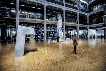
‘Ole Scheeren: Spaces of Life’ promises an in-depth, immersive look into the body of work of its protagonist, and founder of Germany- and China-based architecture practice Büro Ole Scheeren. Launching today (9 December 2022) in the dramatic halls of ZKM | Center for Art and Media Karlsruhe, the exhibition marks not only a return of the Karlsruhe-born architect to his old stomping grounds, but also the energetic studio's first-ever comprehensive solo show, as well as a timely celebration of Scheeren's 20-plus years in independent practice.
The aptly named show, held at its listed Karlsruhe home – an early 20th-century piece of former industrial architecture – and curated by ZKM's chairman and CEO Peter Weibel, brings together a slew of international works of all scales by Scheeren. Showcasing designs that aim to inspire life, joy, community and interaction, the architect's body of work follows his motto, 'form follows fiction'.
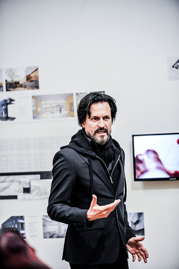
Ole Scheeren
‘Ole Scheeren: Spaces of Life’: the exhibition
On show are everything from specially made models, to AR experiences, drawings, photography and bespoke graphics, all brought together to celebrate and present to the visitors the German architect's overarching philosophy and vision. Büro Ole Scheeren has been behind seminal, instantly recognisable works, such as the Guardian Art Centre in China (2018), Archipelago Cinema in Thailand (2012), the MahaNakhon tower in Bangkok (2016), and the Interlace in Singapore (2014) – not to mention the architect's critical contributions to projects, including Beijing's CCTV, while he was still with OMA, serving as partner in charge of the Dutch studio's Asian projects.
All this and more is revisited through this exhibition, which invites visitors to immerse themselves in Scheeren's architecture through four key thematic units: object, process, context, and consumption.
Below, in a special essay, ZKM's Weibel dissects Scheeren's architecture ahead of the opening.

Curator Peter Weibel on ‘Ole Scheeren: Spaces of Life’
In Ole Scheeren’s buildings culminate tendencies of actual architecture to shape a new form. This 'form follows fiction', as Ole Scheeren proclaims. What kind of fictions?

First, the fiction of the rhizome.
In their book A Thousand Plateaus (1980), Deleuze and Guattari coined the term rhizome, the idea of a horizontal planar non-hierarchical network against the arborescent hierarchic tree-like vertical concept. The focus turned away from the tree to the roots which expand horizontally, creating a multiplicity of networks. Against the vertical delirium of Manhattan, the rhizome represents the horizontal counter-concept. One of the first in architecture to think horizontally was FL Wright. Known as the Prairie Style, his houses reflected the long low horizontal prairie on which the building’s low-pitched roofs, deep overhangs, no attics or basements, and generally long rows of casement windows further emphasised the horizontal theme; for example, the Darwin D Martin House in Buffalo, the Hagan House in Pennsylvania and above all the Frederick C Robie House in Illinois. Wright wanted to integrate architecture into the landscape. Scheeren lifts the spear where Wright has left it to think architecture with respect to the environment. With his building The Interlace (2013, Singapore), he created a vast complex of 31 apartment blocks with the strategy of stacking buildings in a dynamic hexagonal pattern. This pattern of horizontal skyscrapers allowed him to liberate the building for outdoor spaces, open courtyards, for the natural environment, etc. In a virtuoso design, he bridged open spaces with apartment blocks multiplying outdoor decks.

This leads to fiction number two: the void.
Until 1900, sculpture was anthropomorph and zoomorph. Sculptures stood around in space, but did not thematize space. After 1900, the sculptures turned completely to space itself. Kobro (1937): 'Sculpture is a shaping of space.' As a consequence, the new sculptures of the 20th century negated the categories that had been derived from the body: Mass, volume, gravity. The brothers Gabo (1920) 'renounce volume as a plastic form of space'. Rudolph Belling (1923): 'I refer to the space of sculpture as 'weightless form'.' Antony Caro (1973): 'All sculptures have dreams of defying gravity.' And finally, Henry Moore (1937): 'A hole can itself have as much meaning as a solid mass.' Richard Serra (1993): 'I start from the void and form the object from this emptiness.' For Moore, the hole is the intended and considered form. This is precisely the new discovery, also for architecture, that with stacked buildings you can create holes and voids. Usually, skyscrapers are closed boxes, only curtain walls of glass allow some indoor and outdoor exchange, some transparency. With stacked buildings, especially when these buildings are not stacked towers, but horizontal towers like in Scheeren’s The Interlace, you create real voids, which break the skyscraper into pieces of porosity. With his perforated architecture, Scheeren is one of the few architects who are on the level of modern sculpture and radicalised the ideas of modern architects like RM Schindler and Richard Neutra, who introduced the idea of a new relation between outdoor and indoor living.

Fiction number three: zones.
The rhizome transformed the ideas of a city into multiplicity, opening the closed form to multiple zones. Architects like Zaha Hadid and Peter Eisenmann (Rebstock Park, Frankfurt am Main, 2002) as well as Bahram Shirdel (Nara Convention Centre, Japan) started in the 1990s with the help of non-standard topology and folding techniques to use the urban environment as foundation for the forms of the building. A successive geometric mapping of the urban zone helped to generate a building that mirrors this urban zone. These architects understood under environment only the urban zone, not the environment of nature. Zones today, like the buildings of Ole Scheeren, for example in Frankfurt, mean especially natural environment. The void not only opened up the monolithic blocks, but also allowed that light and air could travel through the building. Above all, nature and not the urban zone alone are mapped into the buildings of Ole Scheeren. The surrounding body of nature becomes part of the body of the building. The floors become terraces. It was again FL Wright who pointed the way into the future with his famous building Fallingwater (1935) that was built partially above a waterfall. The waterfall became part of the building – a kind of organic architecture. Scheeren follows this direction. The void in the horizontally stacked buildings of Scheeren therefore became the door to nature.

Fiction number four: urban design.
The 'megabuildings' of Ole Scheeren are part of new ideas about urban design. His megabuildings – precisely through their horizontal structure – allow a composite structure that resembles self-contained cities. Diverse urban blocks are stacked above each other. This is again a method to avoid monolithic closed blocks by voids and by roofs which can become the ground for others. Like the 50-story Gateway of Gensler architects in Los Angeles, the megabuildings of Scheeren can become a city within a city and allow nature to penetrate into the building. The forerunner of these segmented buildings was Paul Rudolph, who broke the vertical box precisely by a multiplicity of outdoor terraces (The Marina Centre, 1979). He even introduced in his never built Gato Subroto Condominium' (1990) void decks. Scheeren’s The Interlace accomplished Rudolph’s idea, likewise his King Power MahaNakhon (2016) building, where cubes pop out, creating an oasis of nature. His buildings in Frankfurt or Vancouver have always aspects of garden buildings.

Fiction number five: hyperbuilding.
Stacking or piling structures save ground for nature and create ground in the sky in a new way. Therefore, many architects follow the concept of Rem Koolhaas and his idea of a hyperbuilding (1996), a megastructure where habitats were mixed with parks, shopping malls with promenades, for example Rex Architects (Museum Plaza, Louisville, 2005) or MVRDV’s Mirador building in Madrid.
Urban zones and natural zones converge in the hyperbuildings of Ole Scheeren. Therefore his buildings are spaces of life. Already in his early experiments as a student at the Architecture Association in London, he developed new devices to investigate the effects of the urban environment on the inhabitants of the city. The results of these explorations pushed him forward to the question: how can we create spaces that serve life? His signature works, The Interlace in Singapore, the MahaNakhon in Bangkok, The Shenzhen Wave in Shenzhen, demonstrate in the best tradition of avant-garde architecture, of which I have cited some examples, a new strategy to define the relation between building and city, building and environment, urban zone and nature zone, precisely for the wellbeing of humans.
'Ole Scheeren: Spaces of Life' runs 10 December 2022 to 4 June 2023 at the ZKM | Center for Art and Media Karlsruhe
buro-os.com (opens in new tab)
zkm.de (opens in new tab)
Ellie Stathaki is the Architecture Editor at Wallpaper*. She trained as an architect at the Aristotle University of Thessaloniki in Greece and studied architectural history at the Bartlett in London. Now an established journalist, she has been a member of the Wallpaper* team since 2006, visiting buildings across the globe and interviewing leading architects such as Tadao Ando and Rem Koolhaas. Ellie has also taken part in judging panels, moderated events, curated shows and contributed in books, such as The Contemporary House (Thames & Hudson, 2018) and Glenn Sestig Architecture Diary (2020).
-
 2022 fashion highlights, as picked by the Wallpaper* team
The Wallpaper* fashion and beauty team reflect on their personal 2022 fashion highlights – from Gaetano Pesce at Bottega Veneta and Wales Bonner in Florence to intrigue and seduction at Prada
By Jack Moss • Published
-
 Marre Moerel’s swinging flame candle uses artful balance
Vita Balanza by Marre Moerel and Santa & Cole has turned candles into a balancing act
By Martha Elliott • Published
-
 At home with Neri & Hu
Architectural super-pair Neri & Hu talk to us about what inspires them, what they are reading, and how they switch off
By Ellie Stathaki • Published
-
 Aachen’s Center for Advanced Mobility is a celebration of technical innovation
Studio MDA's Center for Advanced Mobility in Aachen, Germany celebrates technical innovation and interdisciplinary collaboration
By Pei-Ru Keh • Last updated
-
 Playfully transparent roof defines German Glass House escape
The Glass House by Sigurd Larsen, set amid nature outside Berlin, is an unconventional country home with a distinctive transparent roof
By Ellie Stathaki • Last updated
-
 The iconic BMW HQ in Munich celebrates its half century
Karl Schwanzer designed a corporate icon for BMW. Now 50 years old, the company’s Munich HQ is still going strong
By Jonathan Bell • Last updated
-
 Sustainability, art and German farmhouse architecture meet at Gutshof Güldenhof
Germany's Gutshof Güldenhof is a farming complex transformed into a hub for arts, sustainability and social life, courtesy of Heim Balp Architekten and artist Danh Vo
By Ellie Stathaki • Last updated
-
 A German house appears as a monolithic stone structure
A sculptural villa in the northern German town of Bielefeld is the latest offering by Titus Bernhard Architects
By Jonathan Bell • Last updated
-
 OMA’s KaDeWe in Berlin rethinks shopping
OMA’s KaDeWe department store renovation in Berlin reveals its first phase and reimagines the world of retail
By Yoko Choy • Last updated
-
 U-Bahn: an architectural patchwork of Berlin’s history
Blue Crow Media’s Berlin U-Bahn Architecture and Design Map is an ode to the multiple intersections found in Berlin’s underground design histories
By Nasra Abdullahi • Last updated
-
 Interiors for Ole Scheeren’s Fifteen Fifteen in Vancouver revealed
Fifteen Fifteen, a high-end, high-rise residential development by Ole Scheeren in Vancouver, Canada, reveals its apartment interiors ahead of sales launch
By Ellie Stathaki • Last updated


