Hands on with new Nothing Phone (1): a clearly different smartphone
Nothing Phone (1) launches, hitting the sweet spot between price, performance, and efficiency, and promoting the simplification of your smartphone life
- (opens in new tab)
- (opens in new tab)
- (opens in new tab)
- Sign up to our newsletter Newsletter

We’ve been following Nothing’s journey into the mobile realm – culminating with the unveiling of the Nothing Phone (1) today – with fascination. The London-based start-up has masterfully managed its inception and ethos from the start (opens in new tab), clearly setting out its stall as a tech company that does things differently. CEO Carl Pei, working closely with design director Adam Bates (ex-Dyson) and designer Thomas Howard (also vice head of design at cult Swedish audio master Teenage Engineering (opens in new tab)), set out to make a phone that doesn’t so much as disrupt, but divert.
It would be a stretch to claim that the new Nothing Phone (1) is the salve that soothes and banishes all these very contemporary problems, but it's the first time a new device feels like a step in the right direction, not merely an object built to placate the gods of consumption.
Nothing Phone (1): clearly different

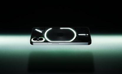
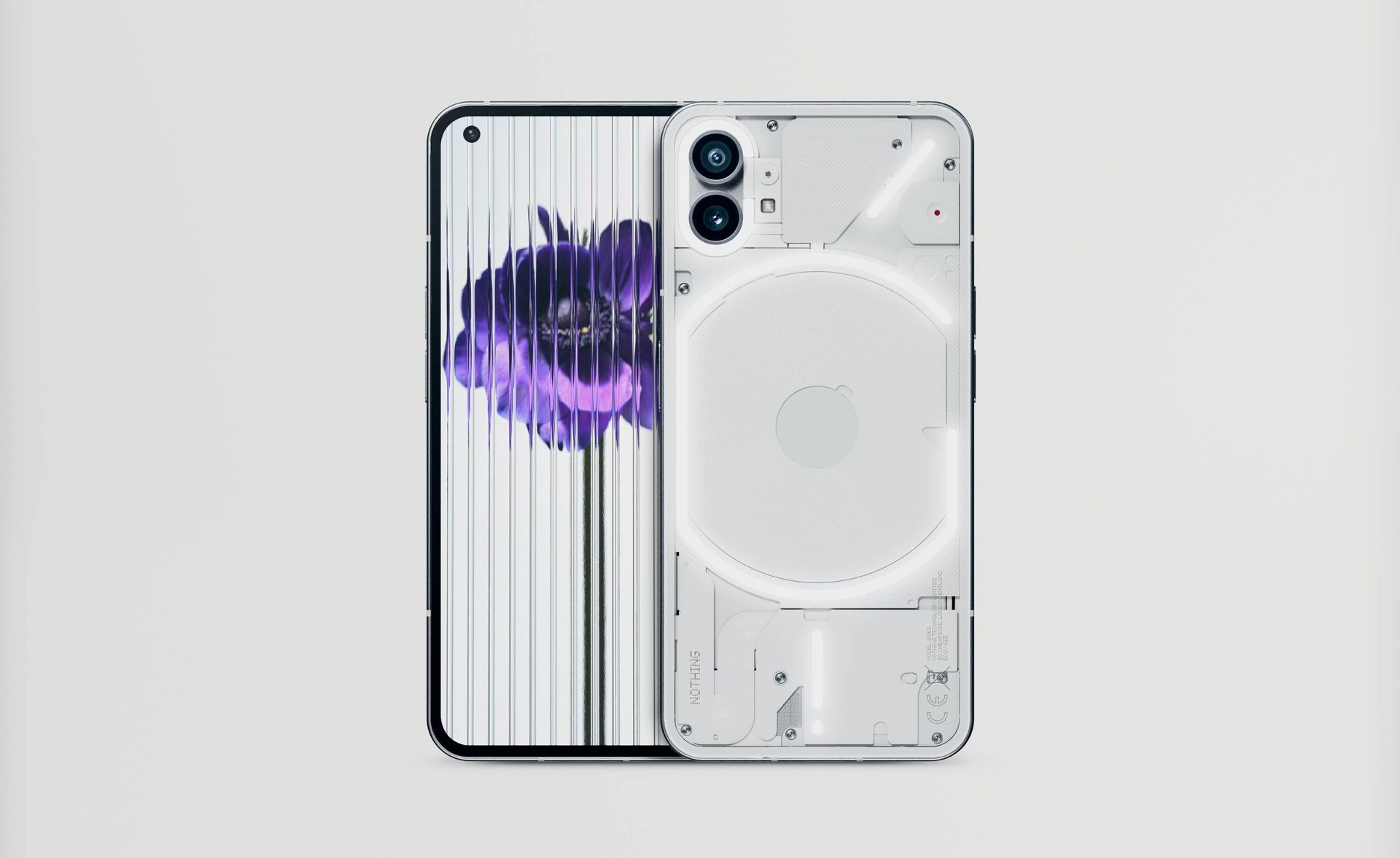
As you can see, the Android-based device takes a different design direction to 99 per cent of its competitors. Gone is the inscrutable sheen of a glass, metal, or plastic body, and in its place is a transparent Gorilla Glass back cover that lays bare the remarkable packaging of a modern consumer technology project.
Woven around these components is a graphical light interface, the ‘Glyph’, a multifunctional display that’s embedded in the Phone (1)’s operating system.

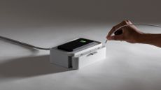
The Glyph isn’t the key selling point, but it’s a refreshing way of doing things differently. When you place your phone face down on a flat surface, the Glyph can be programmed to display different light patterns for different contacts, subtly alerting you to calls that need to be taken and those that can be safely ignored. The 900 LEDs emit a fair dose of brightness and can be used in place of the built-in camera flash for a softer, more enduring light, while the individual lights also have their own associations. The ‘G’ -like primary element indicates the conductive charge pad, for example, which not only charges the phone but allows you to charge the company’s acclaimed Nothing Ear (1) earbuds simply by setting them atop the device.
Another light curves around the twin lens camera set-up, and the diagonal slash indicates the position of the antenna. Finally, there is the bottom ‘exclamation mark’, which roughly corresponds to the location of the cable socket and doubles up as a charge indicator. A separate red LED is also mounted on the rear, lighting up to indicate when you’re filming, camcorder-style.

A streak of retro puritanism runs through all of Nothing’s hardware, graphic identity, and bespoke interfaces and apps. Their dot matrix font logo is faithfully reproduced on screen, and even elements like the bespoke ring tones have a gritty, 8-bit sound that evokes Teenage Engineering’s Pocket Operator series of synthesisers.
Other details impress. The bespoke Recorder app has a similar aesthetic to the cult OP-1 synthesiser’s (opens in new tab) recorder screen, or the ‘Tape’ function of the OB-4 ‘magic radio’ (opens in new tab), although it’s missing the transcription function that has become an essential element of this kind of app. Otherwise, the phone’s eco-system and bespoke apps and wallpapers showcase the linear graphics, clear icons, and smooth animations that Nothing hopes will become synonymous with its brand.

Most importantly, the Phone (1) feels different. It’s lighter than its competitors, and – despite having relatively high-end specifications – it’s aggressively priced to undercut the increasingly premium models from Samsung, Apple, Google, et al. The frame is forged from 100 per cent recycled aluminium, whilst 50 per cent of the plastics used are also recycled. Packaging is paper, and the company promises at least three years of software updates to lengthen its lifespan.
Eschewing the fashion for adding extra cameras, the Phone (1) makes do with two excellent ones from Sony and Samsung, both 50 megapixels and the latter offering a wide-angle view. The selfie camera has 16 megapixels and nestles at the top left of the 6.55in OLED screen (capable of displaying a billion colours). By not going for the latest and dearest tech, Nothing has hit the sweet spot between price, performance, and efficiency. The Snapdragon chipset is responsive and fast, and although the screen might not stretch to the far corners of the device, the bezel is crisply and satisfyingly equally weighted all the way around (a detail that took some major engineering to achieve).

New hardware always brings out the early adopters, eager to have the fastest, smoothest, and most sophisticated machine in their sweaty paws. Nothing’s approach is rather different – what if the latest device isn't all about speed or power, but about the simplification of your smartphone life?
The Phone (1) pares back the digital cruft, the sheer weight of data and the inescapable feeling that we are somehow being completely ruled by the innocuous black slab in our pockets. For one thing, if you’re paying less than four figures for a phone, you feel somehow less beholden to constantly marvel at the device.

The Phone (1) was unveiled before an audience of tech influencers, expert unboxers, corporate investors, and the odd crypto bro, alongside the usual industry media, Pei offered up a modest launch spiel, mirroring the quiet confidence oozed by the device itself (the phone’s own cameras were used to shoot the video).
Nothing’s ambition has always been to build an ecosystem of products, although the range currently stands at a grand total of two. Like the Ear (1), Phone (1) mixes quality tech with competitive pricing, all wrapped up in a package that shows real attention to detail. Will sufficient numbers of Nothing nuts emerge to keep the company aloft for long enough to make it a bona fide challenger? Perhaps. Phone (1) is a likeable and competent device, an object that looks and feels like a lot of thought has gone into it. It might not be a radical tech revolution, but it demonstrates that light sprinkle of imagination is all you need to make a difference.

INFORMATION
Nothing Phone (1), available in black or white
128GB storage, 8GB memory, £399
256GB storage, 8GB memory, £449
256GB storage, 12GB memory, £499
nothing.tech (opens in new tab)
Jonathan Bell has written for Wallpaper* magazine since 1999, covering everything from architecture and transport design to books, tech and graphic design. He is now the magazine’s Transport and Technology Editor. Jonathan has written and edited 15 books, including Concept Car Design, 21st Century House, and The New Modern House. He is also the host of Wallpaper’s first podcast.
-
 Remembering New York artist Daniel Brush, 1947 – 2022
In tribute to Daniel Brush, who has died aged 75, we revisit this 2020 Wallpaper* profile of the elusive New York artist by jewellery historian Vivienne Becker, who unravelled the secrets of his singular designs for her book, ‘Daniel Brush: Jewels Sculpture’
By Vivienne Becker • Published
-
 Interior design books championing shelf love
Welcome to the Wallpaper* guide of the best interior design books published in 2022 and beyond – a collection of riveting visual tomes to feed creative innovation, inspiration and imagination
By Rosa Bertoli • Published
-
 Christmas decorations from leading creatives and design brands
Our edit of contemporary Christmas decorations ranges from architect-designed festive ornaments to Christmas baubles by leading creatives
By Rosa Bertoli • Published
-
 New Kindle Scribe crowns 15 years of evolution of Amazon’s e-reader
We review the latest and most sophisticated Kindle ever made, the Amazon Kindle Scribe, and look back over the device’s 15-year evolution and how it squares up to rivals like the reMarkable 2
By Jonathan Bell • Published
-
 We Are Rewind takes tape into the 21st century
We Are Rewind’s self-consciously retro Cassette Player is designed to tap into our ongoing obsession for analogue formats. Just the thing for your mixtape 2022?
By Jonathan Bell • Published
-
 Ten years of Microsoft Surface: the company’s design team on what comes next
The Microsoft Surface series is a well-established line of premium mobile devices. How are its designers continuing to innovate?
By Jonathan Bell • Published
-
 Wallpaper* wants… ten best-designed wireless chargers for Apple devices
Looking to get rid of wires? Our top ten elegantly designed MagSafe-compatible wireless charging stations will help you find your way through the tangle
By Jonathan Bell • Published
-
 Microsoft goes William Morris: the Surface Pro 9 Liberty Special Edition is now available
The Microsoft Surface Pro 9 Liberty Special Edition is a hybrid tablet and laptop embellished with a bespoke design
By Jonathan Bell • Published
-
 Google accelerates home WiFi with shapely new Nest WiFi Pro router
Google’s newest domestic device is inspired by ceramic art and incorporates the newest ultra-fast standard of WiFi technology, WiFi 6E
By Jonathan Bell • Published
-
 Cut your own grooves with Teenage Engineering’s new Record Factory
The PO-80 Record Factory from Yuri Suzuki and Teenage Engineering is a musical toy with a serious side
By Jonathan Bell • Last updated
-
 The little Amazon Astro is a big company’s first foray into domestic robotics
Amazon is betting big on home automation. Can the friendly-looking Astro ensure our relationship with robots gets off to a healthy start?
By Jonathan Bell • Last updated


