Google Bay View Campus by BIG and Heatherwick Studio reimagines workspace
Google has worked with architects BIG and Heatherwick Studio on the new Bay View Campus in Silicon Valley
- (opens in new tab)
- (opens in new tab)
- (opens in new tab)
- Sign up to our newsletter Newsletter
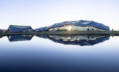
The Google Bay View Campus has opened. Architects Bjarke Ingels Group (BIG) and Heatherwick Studio have worked with Google’s own design and engineering teams for the new Silicon Valley campus, the first major campus the company has developed itself.
Spanning a vast 42 acres and located next to Nasa’s Ames Research Center, the campus encompasses 1.1 million square feet and is composed of 20 acres of open space, two office buildings, an events space that can hold up to 1,000 people, and short-term accommodation for 240 employees.

‘The idea of the “office” has been stuck for a long time,’ says Thomas Heatherwick, founder and design director of Heatherwick Studio. ‘Yes, people have done different aesthetic treatments. But there hasn’t been a fundamental questioning of the workplace at this scale. Our approach has centred on the emotions of individuals and the imaginations of teams and how you create a whole different atmosphere of work.’
This aesthetic takes shape in a building that balances the need for space to work with the opportunity for collaborative communication. A focus on greenery and access to natural daylight and views from every desk aims to increase the wellbeing of employees; clerestory windows ensure desks are in direct light, while automated window shades open and shut throughout the day.
A ventilation system, meanwhile, uses only air from outside, ensuring there is no recycled air, while a thorough vetting of products and materials keeps toxins in the environment to a minimum.

‘Our design of the new Google Bay View campus is the result of an incredibly collaborative design process,’ says Bjarke Ingels, founder and creative director of BIG. ‘Working with a client as data-driven as Google has led to an architecture where every single decision is informed by hard information and empirical analysis.
‘The result is a campus where the striking dragonscale solar canopies harvest every photon that hits the buildings; the energy piles store and extract heating and cooling from the ground, and even the naturally beautiful floras are in fact hardworking rootzone gardens that filter and clean the water from the buildings. All in all, it’s a campus where front of house and back of house, technology and architecture, and form and function have been fused into a new and striking hybrid.’

Sustainability is also a key element of the design, with an integrated geothermal pile system – the largest in North America – intended to reduce carbon emissions by approximately half, while the campus is also fully electric. Practical solutions such as above-ground ponds and wind farms will help realise Bay View’s aims of both fully operating on carbon-free energy and replenishing 120 per cent of the water it consumes by 2030.
The local environment also benefits, with over seven acres of natural land, including woodlands and marsh, helping to reestablish habitat in the area, while the public can enjoy access to trails around the Bay.


INFORMATION
Hannah Silver joined Wallpaper* in 2019 to work on watches and jewellery. Now, as well as her role as watches and jewellery editor, she writes widely across all areas including on art, architecture, fashion and design. As well as offbeat design trends and in-depth profiles, Hannah is interested in the quirks of what makes for a digital success story.
-
 Design podcasts to discover: creative giants share smalltalk and big ideas
Listen to the best design podcasts by creators, curators and journalists shining a spotlight on different areas of the design practice
By Rosa Bertoli • Published
-
 2022 fashion highlights, as picked by the Wallpaper* team
The Wallpaper* fashion and beauty team reflect on their personal 2022 fashion highlights – from Gaetano Pesce at Bottega Veneta and Wales Bonner in Florence to intrigue and seduction at Prada
By Jack Moss • Published
-
 Marre Moerel’s swinging flame candle uses artful balance
Vita Balanza by Marre Moerel and Santa & Cole has turned candles into a balancing act
By Martha Elliott • Published
-
 IQON is BIG’s South American debut in Quito
Quito gets a brutalist urban addition – IQON – courtesy of Bjarke Ingels and Ecuadorian developer Uribe Schwarzkopf
By Rainbow Nelson • Published
-
 Heatherwick Studio unveils undulating mixed-use Tokyo scheme design
By Ellie Stathaki • Last updated
-
 BIG’s Refugee Museum of Denmark addresses ‘one of the world’s greatest challenges’
BIG has converted and extended buildings at a Second World War Danish refugee camp to create the new Refugee Museum of Denmark
By Hannah Silver • Last updated
-
 Heatherwick Studio’s glasshouse architecture flowers in the English countryside
Heatherwick Studio’s new glasshouse is a floral haven in West Sussex's Woolbeding Gardens
By Nick Compton • Last updated
-
 Heatherwick Studio’s 1000 Trees blooms in Shanghai
Heatherwick Studio’s 1000 Trees is Shanghai’s newest mixed-use development, blending trees, art and sculptural concrete
By Nick Compton • Last updated
-
 Bjarke Ingels’ Nabr aims to disrupt the housing market
Nabr, the new company co-founded by Bjarke Ingels, real estate entrepreneur Roni Bahar and tech veteran Nick Chim, is planning a housing market shake-up
By Pei-Ru Keh • Last updated
-
 CAW Architects designs colourful Google office near Palo Alto
This colourful Google office designed by California-based CAW Architects is a bold, playful and nature-filled new home for the tech giant’s family in Mountain View, CA
By Ellie Stathaki • Last updated
-
 Inside Thomas Heatherwick's anticipated Lantern House in New York
We offer the first view inside Thomas Heatherwick's luxury residential development Lantern House in New York, featuring interiors designed by MAWD
By Ellie Stathaki • Last updated


