Black Kite’s London office is a riot of colour and geometry
Architecture studio Bureau de Change designs Black Kite, a London office defined by shapes and colours
- (opens in new tab)
- (opens in new tab)
- (opens in new tab)
- Sign up to our newsletter Newsletter

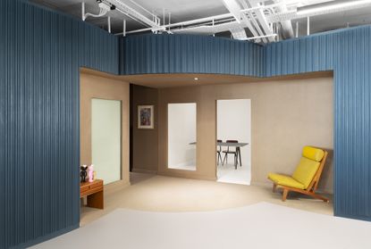
Black Kite, an independent visual effects and design studio in east London, just got a new office – an uplifting space defined by colour and shape, designed by architecture studio Bureau de Change. Practice founders Katerina Dionysopoulou and Billy Mavropoulos carefully curated the space around a series of cleverly intersecting and carved-out cylinders, resulting in a London office that bridges heritage, playfulness and contemporary design.
The concept for this colourful office is far beyond an architectural flight of fancy. Composed to support workspace functionality, the cylindrical volumes help create varying degrees of privacy, carving out anything from quiet reading nooks, to gathering spaces, desk booths and discreetly tucked-away meeting areas.

At the same time, the architects made sure their design works in harmony with the site's industrial, East End heritage. The round shapes that have been gently placed within the floorplan abstractly resemble iron kilns. A retained grid system of slim, internal exposed concrete columns reinforced that approach, as does the relatively restricted material palette. Meanwhile, carefully planned contemporary furniture is playfully juxtaposed with the industrial atmosphere's roughness, resulting in a pared-down, yet warm whole.
‘We are proposing a scheme that extracts and interpolates volumes and motifs of traditional Victorian foundries and kilns to create a gradient of introverted to extroverted spaces, seamlessly integrated together through a bespoke layout and design language,' says Dionysopoulou.

Listening to its client's needs, Bureau de Change generated a relatively open-plan interior with dedicated enclosed sections to respond to Black Kite's requirements for production and visual effects suites that should be isolated from external sources of light and sound. The site's tall ceilings and generous overall proportions help to allow these structures to breathe.
Textures and finishes were equally important in the overall composition. ‘Each of the volumes is clad in painted routed timber surfaces, informed by the vertical seams of traditional iron kilns. The cut-outs are finished in a rough clay plaster, juxtaposing the sharper articulation of the cylinders with warm cave-like textures, further adding to the journey of materials, textures and colours in the space,' Mavropoulos adds.


INFORMATION
b-de-c.com (opens in new tab)
Ellie Stathaki is the Architecture Editor at Wallpaper*. She trained as an architect at the Aristotle University of Thessaloniki in Greece and studied architectural history at the Bartlett in London. Now an established journalist, she has been a member of the Wallpaper* team since 2006, visiting buildings across the globe and interviewing leading architects such as Tadao Ando and Rem Koolhaas. Ellie has also taken part in judging panels, moderated events, curated shows and contributed in books, such as The Contemporary House (Thames & Hudson, 2018) and Glenn Sestig Architecture Diary (2020).
-
 34th São Paulo Bienal arrives at Luma Arles for first European presentation
An exhibition of highlights from the 34th São Paulo Bienal is at Luma Arles, marking its European and tour finale
By Martha Elliott • Published
-
 This winter’s most stylish skiwear, Gucci to Hermès
Statement-making skiwear for on and off the slopes, from Louis Vuitton, Dior, Moncler and more
By Jack Moss • Published
-
 Clásicos Mexicanos celebrates Mexican design’s golden age
Design Miami 2022: the Maestro Dobel Artpothecary in collaboration with Clásicos Mexicanos features works from Mexican architect Ricardo Legorreta’s ‘Vallarta’ collection
By Sujata Burman • Published


